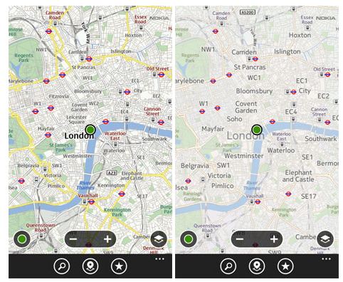
 As more people turn to mobile devices to find out where they are going, Microsoft and Nokia are spending precious resources on making sure that they have the easiest and cleanest mobile maps. The two companies — following on their strategic partnership from last year — today announced a unified mapping experience across Nokia and Windows Phone devices.
And what does the future of mobile mapping look like?
The Bing Maps team writes in a blog post that their aim was to “improve contrast and usability” in an effort to “create a more beautiful and functional map.” They continue:
We focused significantly on improving various typography components in order to provide further clarity on maps including font updates, improved readability and contextual labeling. Type size hierarchy further delineates classes of labels. The user watches city names consistently grow and become more transparent through the zoom levels. Small type is demystified from its surroundings with a technique that reduces clutter instead of adding glows or ever-present strokes. The right use of typography helps our customers consume mapping details more quickly.
In a separate blog post, Nokia adds that the new maps are simpler and easier to interpret.
There are fewer intrusive objects, icons and signs that get in the way when you just want to navigate. If you are exploring places in a city you might want to see the local art gallery or eating options but if you are planning a route you just need to know where you are going and the best way to get there.
Take a look at these examples below (with before and after images) and see if Bing, Nokia and Windows Phone hit the target or not.


