") Microsoft today confirmed that it has redesigned the Windows logo for the Windows 8 release.
Microsoft today confirmed that it has redesigned the Windows logo for the Windows 8 release.
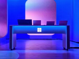
The logo, above, reflects the tile-based interface of Windows 8 and the “Metro” style that Microsoft has been adopting across its consumer products. To help create the logo, Microsoft tapped the Pentagram design studio, which has done work for everyone from Saks Fifth Avenue to the Daily Show.
In a blog post, Microsoft’s Sam Moreau tells the story of the logo’s creation. He notes that, despite its past evolution, the Windows logo was never really meant to be a flag.
“Windows really is a beautiful metaphor for computing and with the new logo we wanted to celebrate the idea of a window, in perspective,” he writes. “Microsoft and Windows are all about putting technology in people’s hands to empower them to find their own perspectives. And that is what the new logo was meant to be. We did less of a re-design and more to return it to its original meaning and bringing Windows back to its roots – reimagining the Windows logo as just that – a window.”
Microsoft is slated to release the Windows 8 Consumer Preview later this month. The company hasn’t set a date for the final release, but it’s widely expected sometime later this year.