Google changed the structure of its company in August, and now less than a month later, it has a brand new look.
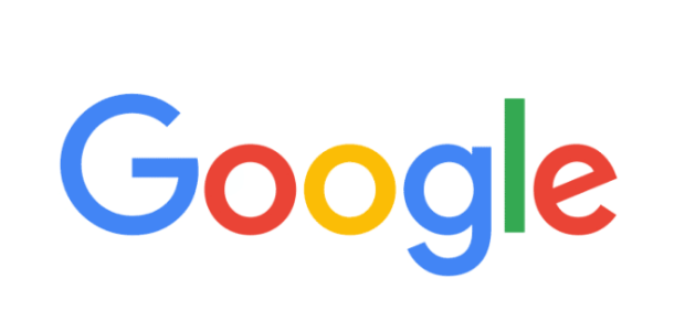
The tech giant today unveiled its revamped logo, which keeps the same “Google” company name and the multi-color sequence but uses a different, custom sans-serif typeface that’s a bit more playful and rounded.
You can see the new logo above, and for comparison, here’s the old logo that we’ve become familiar with:

Google is also changing up the look of the Google “G”:

“This isn’t the first time we’ve changed our look and it probably won’t be the last, but we think today’s update is a great reflection of all the ways Google works for you across Search, Maps, Gmail, Chrome and many others,” Google wrote today. “We think we’ve taken the best of Google (simple, uncluttered, colorful, friendly), and recast it not just for the Google of today, but for the Google of the future.”
The video below shows how Google’s logo has evolved since 1999, and this seems to be the biggest change since then.
Google details the re-design process here, and notes four challenges the company’s designers wanted to address:
A scalable mark that could convey the feeling of the full logotype in constrained spaces.
The incorporation of dynamic, intelligent motion that responded to users at all stages of an interaction.
A systematic approach to branding in our products to provide consistency in people’s daily encounters with Google.
A refinement of what makes us Googley, combining the best of the brand our users know and love with thoughtful consideration for how their needs are changing.
Here’s a bit more on the thinking behind the logo redesign:
The Google logo has always had a simple, friendly, and approachable style. We wanted to retain these qualities by combining the mathematical purity of geometric forms with the childlike simplicity of schoolbook letter printing. Our new logotype is set in a custom, geometric sans-serif typeface and maintains the multi-colored playfulness and rotated ‘e’ of our previous mark—a reminder that we’ll always be a bit unconventional.
The new logo mimics the design used for Alphabet, the new holding company that Google announced last month which includes Google itself as a subsidiary.
Speaking of logo changes, Microsoft rolled out its first major logo revamp in 25 years back in August 2012.