The homepages of travel websites are usually chock-full of information, from travel offers, trip itineraries and advertisements.
Expedia, however, is looking to simplify the user experience with a new design that focuses on large images.
The Bellevue-based company is testing out a new website layout via a banner at the top of the homepage that reads: “Be a part of something BIG. We’re working on a new look and want your feedback.”
The new look, pictured above, is all about big images and far fewer things to click on.
Here’s the current design:
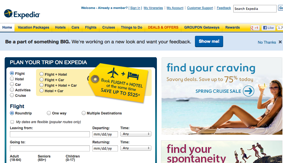
The beta design reminds me a bit of Orbitz and airbnb, two travel sites that feature images predominately.
The image-inspired strategy isn’t new for Expedia. In January, as part of its “Find Yours” advertising campaign, Expedia introduced a Facebook app called “Find Your Story“ that allows users easily put together motion pictures with their travel photos. It’s a clever way to help people create shareable memories from their trips.
Expedia, one of the top performers in Seattle tech for 2012, remains the top dog in online travel. The site accounted for 31 percent of all page views in the category and had $4 billion in worldwide sales in 2012.
So, what do you think? Do the simpler design and big photos improve your searching experience? Or do you prefer all your information and options at once?