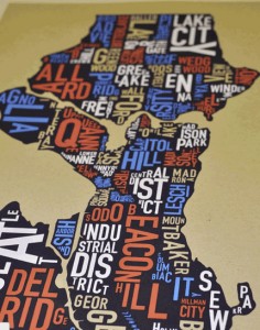
This is pretty cool. Microsoft researcher Andrés Monroy-Hernández, an expert in social media analysis, has come up with an interesting way to view Seattle. (One we’ve never quite seen before).
Think of it as the citywide Tweet map — in the style of the popular Ork Posters. The map was created using Twitter data over a two month period, so for example you can see that words such as “coffee” and “weekend” are associated with Capitol Hill or “Seattle PD” and “apple” are associated with the U. District.
“The (map) is definitely biased towards volume. So the loudest is the most visible, which is part of the provocation,” says Monroy-Hernández in a Tweet to describing the map.
I’ve got to say that I am not too wild about the idea of living in an area where the most prominent words are “response armed.”
Ugh…
Maybe I’ll move over to the Roosevelt area where they seem to love “beer” and “toys.” There are some oddities on the map, like the fact that “wallingford” is one of the the prominent words in the heart of the Ballard neighborhood. I am also not quite sure why Seward Park has been labeled “broken,” or why “salt” appears to be such an important issue in the Lake City area.
There are also a few Twitter handles that make an appearance on the map like @jcrossover — the handle for former Rainier Beach High School basketball star Jamal Crawford — and @jseattle — the handle for Capitol Hill Seattle blogger Justin Carder.
UPDATE: Monroy-Hernández tells us that map came about as part of the Maker Fest at Microsoft Research, since he wanted to pursue the idea of “data-driven art” that he could imagine hanging on his walls.
“As I recently moved to Seattle, I have both empty walls and an interest in art that represents my new city,” he said.
Here’s more on how the Tweet map works:
Since it’s volume driven, the neighborhoods with low activity are over-represented by tweets from the police department. So it was partly provocative, to say: ‘hey, not everyone is tweeting at the same rate.’ We extracted all the tweets of people whose profile says they live in Seattle in a period of two months. We got a list of each neighborhood in Seattle, then we identified tweets by neighborhood using specific keywords — for example “cap hill,” “capitol hill,” even misspellings like “capital hill.” Then once we had a data set for each neighborhood, we then combined neighborhoods that were very close to each other, such as Montlake and Capitol Hill, so that the visuals were easier to read.
Take a look and let us know what you think. What word would you like most associated with your neighborhood? Does this accurately represent your neighborhood?


