Editor’s Note: This post was originally published on Seattle 2.0, and imported to GeekWire as part of our acquisition of Seattle 2.0 and its archival content. For more background, see this post.
By Kelly Smith
What makes a tight looking website?
Let me categorically state right up front that I’m not formally trained in design. I didn’t study anything in college besides boring mechanical engineering classes, business and history. Now that we’ve established that my observations aren’t backed by some creative degree I will say that I’m willing to work hard to prove the point that attention to detail in execution can add millions of dollars in valuation to the very lines of code that currently underpin most web applications out there. Recently, I had just such a conversation with a former co-founder of a previous software project which was sold last year. We knew that the culture of the team allowed the organization to deliver effective solutions to complex problems in the industry. But we also knew that our solutions weren’t always as elegant as they could be. We just didn’t focus on user interface and ease of use. And, as it turns out, we were able to conclude that a better user interface and consumer experience would probably have added at least another $10 million to the purchase price paid.
In my view, a style guide should accomplish three things:
- Help you use fewer elements and still be more effective
- Creative a perception of cleanliness and order
- Help explore and implement new features from a solid foundation
A great style guide example
I really love the look of the style guide that Area17 developed for their own interactive agency. Here’s a few examples of how a style guide can define elements which ultimately create a feel of usability and consistency throughout your project.
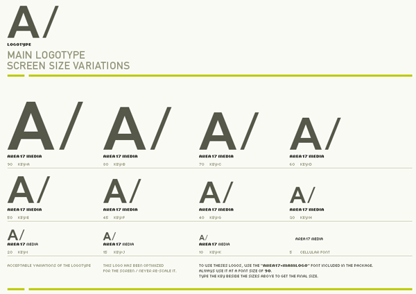
Multiple examples of logo implementation:
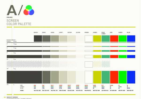
Here is the screen color palette defined:
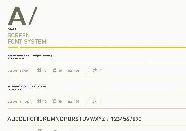
Here’s a screenshot of the font system:
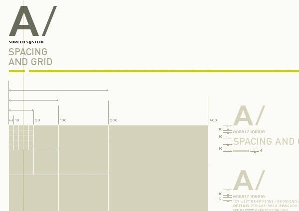
Portion of the defined site grid:
And, finally, a little overview of the main site elements shown together:
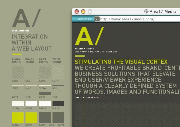
You can view the entire AREA 17 styleguide here.
The concepts of interaction design and interface design are big ones. It wouldn’t be practical to try to dig deep into that here and I don’t have a degree in either of those disciplines anyway so be thankful this advice is free :) The biggest thing to remember is that if you introduce something new, make sure that you are doing it knowingly and for good reason.
Three real world examples
To keep this post as brief as I can I’ll only list a few examples of how a style guide can help enforce discipline.
1) Avoid too many button styles. I hate to pick on a former company of mine but I just happened to notice yesterday a really good example of something that I wished the design team DIDN’T do with this new design. Admittedly, these are SMALL things. But small things matter. And a list of small things could quickly grow into a big list. In this case, corner radius’s on buttons are needlessly different. Check out the Search and the Start Shopping button. When you see things like this there are other examples elsewhere to be found throughout the site.

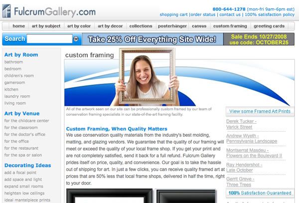
2) Avoid too many text styles. Let’s stick with the art theme. Consider this snapshot from the front page of FulcrumGallery.com There are about 7 different text treatments just in this one small space. Wow. Why?

3) Avoid too many padding and spacing styles. Now the guys at Fulcrum know I like them (and I do) but since I’m using this site as an example I’ll just continue with another screenshot. Here there are at least 20 different text styles with varied related elements such as padding and spacing – not to mention weights, colors, appearances, sizes etc. Quite a bit of CSS and Photoshopping just to maintain and update this one (seemingly) simple page.
- build consensus between developers and the business side
- keep code simple and compact
- make global updates easier
- create a perception of order and logic
- free your mind to think about content on each page


